Professional Portfolio
-

Data Analysis & Visualization
-

Cartography & Geospatial Analysis
-

Professional Writing
-

Photography & Design
Recent Work
Click to interact with map
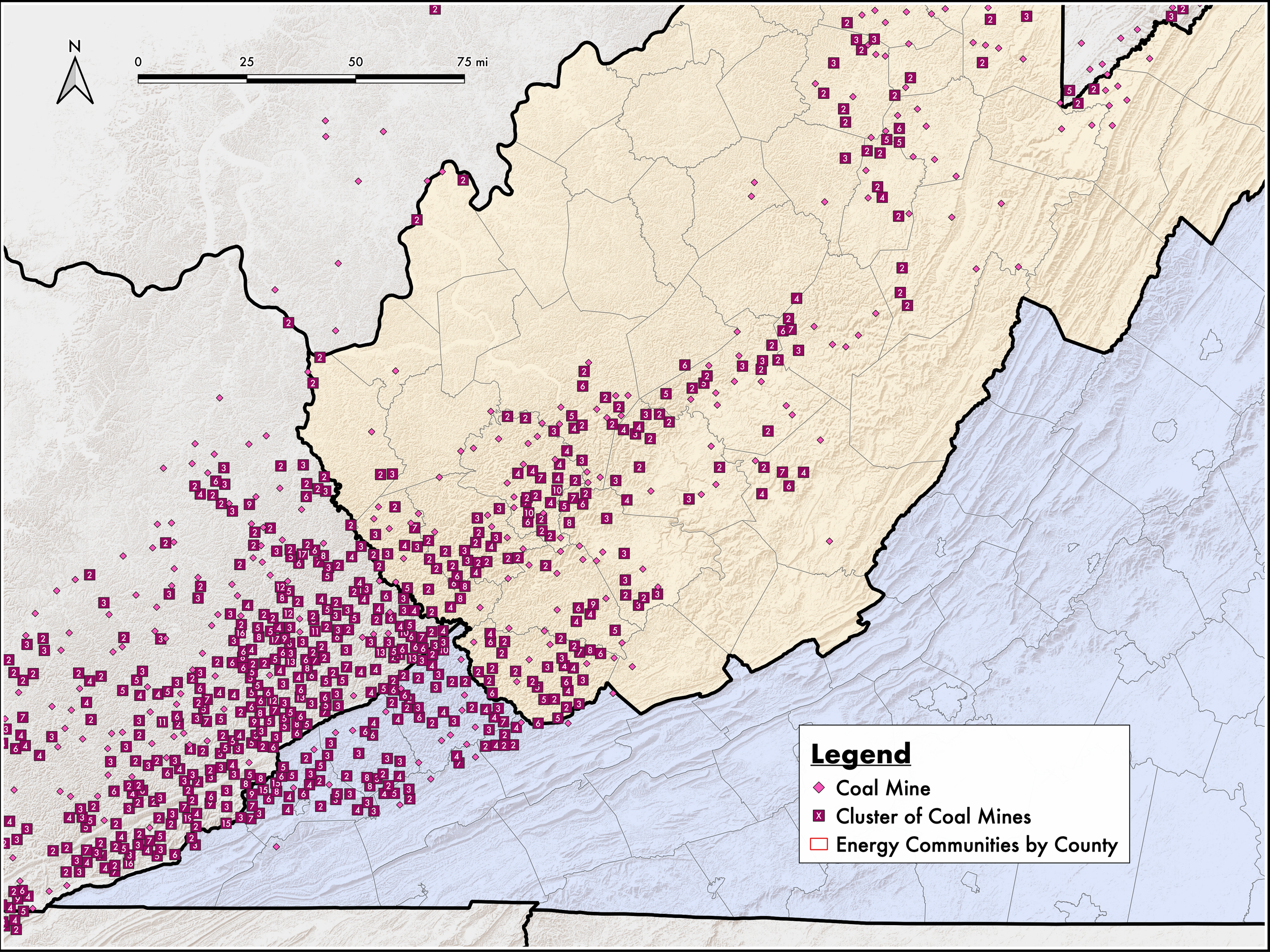
Energy Communities Interactive Map
This is an interactive map I created using ArcGIS to show the geographic distribution of various features that would qualify solar projects in certain municipalities, Census tracts, or property parcels for additional tax incentives under the 2022 Inflation Reduction Act. It has been a useful tool at Secure Solar Futures for better understanding our regional market.
This process involved sourcing and cleaning various publicly available data, compiling them in ArcGIS desktop, and transferring them into an interactive web map format in ArcGIS online. Among other qualifying factors often revolving around fossil fuel industry presence, the features in this map include proximity to closed coal mines, retired coal plants, and brownfield sites.
Solar Today, Summer 2022
I had the privilege of co-authoring the featured cover article with Dr. Tony Smith in the Summer 2022 issue of Solar Today. This piece is monumental in reshaping our understanding of the role that solar will continue to play in increasingly decarbonizing energy grids.
Based on our in-depth analyses of the historical performance of Secure Solar Futures’ existing solar arrays, we found that solar is able to reliably and predictably reduce peak demand, both on individual customers’ bills and more broadly for the grid.
Click figures to enlarge
In both cases, this study demonstrated that solar can act as an integral and resilient component to energy grids at various scales, especially those who experience their peak load for the year during mid-day hours in summer months. Our findings implicate the ways in which solar is owned and regulated, as well as how the benefits of cheaper and more resilient energy should be passed along financially to rate payers through bill credits.
This figure represents the core of our research as a highly granular look at the interface between solar generation and demand on the grid. It visualizes peak demand reduction by time of day at a cold storage facility, recreating the highest demand value at any 15-minute interval with and without solar during 2019 and 2020. Compared to what would have been a prominently day-peaking profile without solar, relatively level peak demand was maintained throughout the day with solar.
Another important aspect of this phenomenon is the reduction that customers can see in their monthly billed peak demand. This figure shows results from eight facilities with varying levels of peak demand and array sizes. Solar contributed to summer peak-load shifting from midday to mornings and evenings, primarily during weekdays. Each point represents monthly demand peaks for all facilities analyzed, including when they occurred. Summer months (May-August) are shown above, but similar patterns were found with annual peak-load shifting.
The full Solar Today article with additional background and figures can be found here.
Recent Solar Projects
In addition to my personal aerial photography work, I am the designated drone photographer for Secure Solar Futures, documenting all of our solar projects as they are completed for customer use and other marketing purposes. Some recent projects are shown here, but more can be found on the Photography & Design page.

